 |
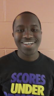
| Before |
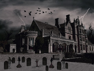
This project was a contest. The target audience for this is high school students and teachers. I used Photoshop to create this project. I focused on the design element contrast because I wanted the red to contrast with everything and stick out. I learned how to liquify, make demon eyes, make blood, and mask hair on another person. I choose a red and black color palette because those are the colors I think of when I see a vampire or demon. This was very difficult at first but at the end of this project it became very fun and I laugh every time I see the after picture. I could improve on making lighter skin and blending an object over another object.
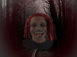 |
| After |
