 |
| Before |
 |
| After |
The client for this design was Mrs.Spivey. The target audience was high school students and teachers. I used Adobe Illustrator CS6 to create this T-shirt design. I incorporated the design element of contrast and balance in both of my designs. I learned from this assignment is that a design everyone else may like the client wouldn't. I used a color palette of teal, black, gray and, white. It was tough making the redesign because I couldn't think of a way to change it so I did a completely different design. I improved by adding less objects in my design.


 The client for this design was the Bayside Senior class of 2014.The target audience was High school seniors. The software I used was Adobe Illustrator CS6. The design element I focused on was emphasis and contrast of fonts. I learned how to blend the different fonts into a design and have them flow together. I used a black, teal, and white color palette because that's the Bayside's colors. It was easy to make a design with the senior slogan because it's a pop culture saying. I could improve if I knew more about fonts and color schemes.
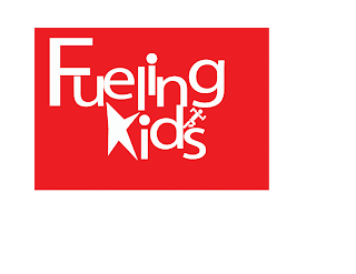
 The client for this design was the Fueling Kids club. The target audience was elementary school children and their parents. The software I used was Adobe Illustrator CS6. I used the design element contrast. I used a bright color palette because bright colors gives the logo a happy and child like feel. When I first started this design I was frustrated because everything I made was either too much action for a logo or too little. After a few days I was able to find a good medium for this logo. I could improve this logo by using different fonts and sizes.