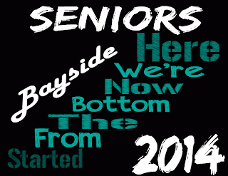
 The client for this design was the Bayside Senior class of 2014.The target audience was High school seniors. The software I used was Adobe Illustrator CS6. The design element I focused on was emphasis and contrast of fonts. I learned how to blend the different fonts into a design and have them flow together. I used a black, teal, and white color palette because that's the Bayside's colors. It was easy to make a design with the senior slogan because it's a pop culture saying. I could improve if I knew more about fonts and color schemes.
Friday, September 27, 2013
T-shirt Design
 The client for this design was the Bayside Senior class of 2014.The target audience was High school seniors. The software I used was Adobe Illustrator CS6. The design element I focused on was emphasis and contrast of fonts. I learned how to blend the different fonts into a design and have them flow together. I used a black, teal, and white color palette because that's the Bayside's colors. It was easy to make a design with the senior slogan because it's a pop culture saying. I could improve if I knew more about fonts and color schemes.
Subscribe to:
Post Comments (Atom)
No comments:
Post a Comment