Thursday, December 5, 2013
Congressional Art Project
The intended message of this piece is to show that at the end of the day, our government is made by American citizens and not corporations and companies that want to make a profit. I used this piece because I never used these skills before and I really liked the result of the piece. I used Adobe Photoshop and learned how to make a text portrait and new ways to use the overlay feature. I would add a silhouette of people saluting the flag if I had more time to modify this piece. I liked the freedom I had for choosing what I could do for this project. I found doing the overlay and transparency to be the hardest part of this project. I wouldn't choose something different because this was exactly what I wanted for my piece.
Monday, November 25, 2013
Congressional Art Mockup
A mock-up is a prototype or design of the layout. The sketch illustrates a salute to the american flag even when things are bad. A pencil and notebook paper was used to create this sketch. I placed the paper on the scanner and started the canoscan software. The personal feedback I received was that my sketch was very creative. You would see the colors in the final project.
Wednesday, November 13, 2013
Photoshop Tutorial
This tutorial taught me how to do a text over an image. I chose this tutorial because I wanted to create a design with the Constitution over the american flag. I used Photoshop and learned new skills using overlays. I will probably modify the tutorial and add this flag a background of war or with the background of a government building. I liked how this tutorial said which parts were optional and that different colors can add a better effect. I couldn't really find anything difficult because the tutorial was easy. I would probably choose this and add something else to it and make it unique to myself.
Tuesday, November 12, 2013
Photoshop Tutorial
This tutorial was intended to teach me how to blend pictures and text on a brick wall. I choose this tutorial because I wanted a graffiti style artwork for my congressional art piece. I used Photoshop and I learned how to use filters and how to place images in text. I modified the tutorial for a patriotic theme. I like how it used filters because it taught me how to use filters in Photoshop. It was difficult finding out which filter was best to use. I would chose something different because it's not exactly what I wanted.
Friday, November 8, 2013
Outline
Outline
Graphic: Flag Eagle
Typography: Grafitti art
Sketch:
Dimensions: 11x14in
Photoshop Canvas
Source files: .psd 150 resolution; .jpg edmodo; blogger; .pdf Can’t exceed 500px in any direction
January 31st, 2014 (See Timeline)
Color Generation: CMYK full color print
Paper Stock: Printer paper
Brainstorming: I want to have a graffiti style art piece on a wall.
Theme: I want my theme to be about America's freedom.
Wednesday, October 30, 2013
Photoshop
 |
| Before |
Thursday, October 10, 2013
Photoshop
 |
| Before |
 |
| After |
Monday, September 30, 2013
T-Shirt Design
 |
| Before |
 |
| After |
T-Shirt Design
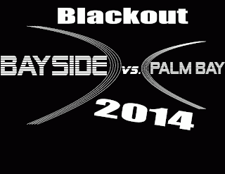
The client for this T-Shirt was the Blackout game director. The target audience is high school students and teachers. I used Adobe Illustrator CS6 to create this T-Shirt design. I focused on the design element of lines because I've never tried using lines. I used a black and white color palette because it was for a blackout game. It was hard just working with black and white because the colors were so simple, and it was only two colors to work with. I can improve by using multiple elemetns and finding different ways to add objects.
Logo Design
Logo Design
The client for this logo was the Melbourne Air and Space Show judges. The target audience is aircraft enthusiasts and all ages of the public. I used Adobe Illustrator CS6 to make this logo. The design element I focused on was white space and contrast. I learned how to bring objects closer together to make the design look better, and I also learned how to make variants. I used a primary color palette because I wanted to give the objects a natural color. I went through many revisions in this logo and it took me a week to finally get it right. I could improve with better drawing skills because all of the graphics were made by me.
Photoshop
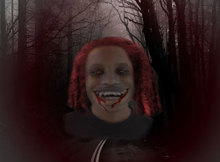
The client for this design was Mrs.Robertson. The target audience was myself. I used Adobe Photoshop CS6 to make this design. I focused on the design element of texture. I learned how to use composites from doing this design. I used a red and black color palette because they blended together. It was a quick review of how to use Photoshop, and it was a simple assignment. I could improve by using a different font or changing the composite of the picture.
Friday, September 27, 2013
T-shirt Design
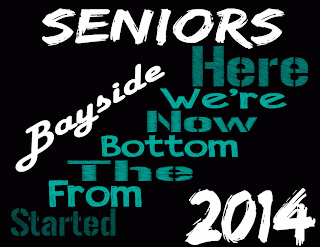 The client for this design was the Bayside Senior class of 2014.The target audience was High school seniors. The software I used was Adobe Illustrator CS6. The design element I focused on was emphasis and contrast of fonts. I learned how to blend the different fonts into a design and have them flow together. I used a black, teal, and white color palette because that's the Bayside's colors. It was easy to make a design with the senior slogan because it's a pop culture saying. I could improve if I knew more about fonts and color schemes.
Logo Design
 The client for this design was the Fueling Kids club. The target audience was elementary school children and their parents. The software I used was Adobe Illustrator CS6. I used the design element contrast. I used a bright color palette because bright colors gives the logo a happy and child like feel. When I first started this design I was frustrated because everything I made was either too much action for a logo or too little. After a few days I was able to find a good medium for this logo. I could improve this logo by using different fonts and sizes.
Subscribe to:
Comments (Atom)


